Content
What is Content?
Content is where you will find detailed information about your site’s performance, which includes overall page views, what pages have been viewed the most and the least (and not at all), page load time, and more.
Summary
Your Content Summary dashboard can be customized to display the metrics you’re most interested in viewing at a glance. By default, Siteimprove displays the metrics which most users would consider the most requested data reports.
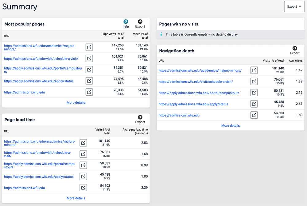
Most Popular Pages
Your most popular pages, based on the number of page views. You can use this data to understand what pages visitors to your site are viewing the most and what pages are being viewed the least. This can be helpful to making important decisions about your content as it provides insight into what content your users are seeking out and care about and how to better organize content to improve your user’s overall experience on your site.
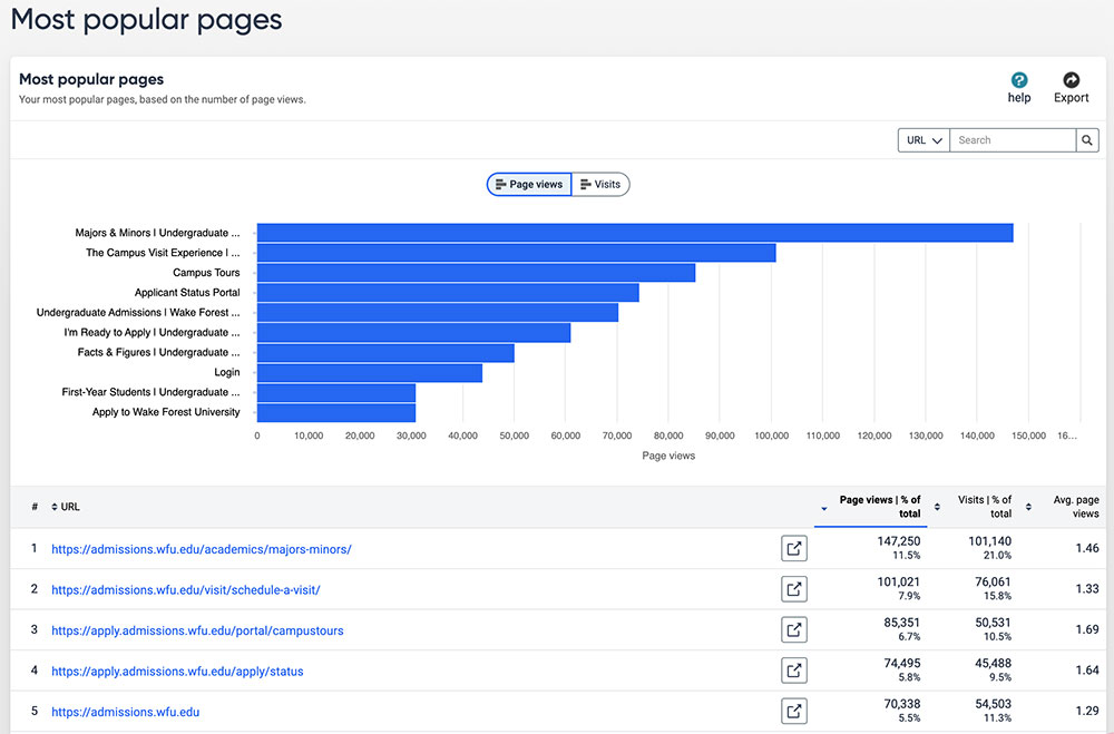
Least Popular Pages
Least visited pages on the website based on page views – especially useful when looking to scale down your website, or thinking about reorganizing your content based on how people are using your site.
We recommend that if you have a small to medium sized site (less than 50 pages), that you look for your least popular pages within All Pages. The reason for this is because you will likely find several page URLs that are uninterpretable. These may be the result of how Google or other search engines crawl your site, bots, how visitors search for content on your site, and other factors. However, if you have a large site, you may find this feature useful to filter pages.
All Pages
All pages with visits on the site. There may be pages on your website that do not appear here because they have no visits or aren’t included within your site’s domain.
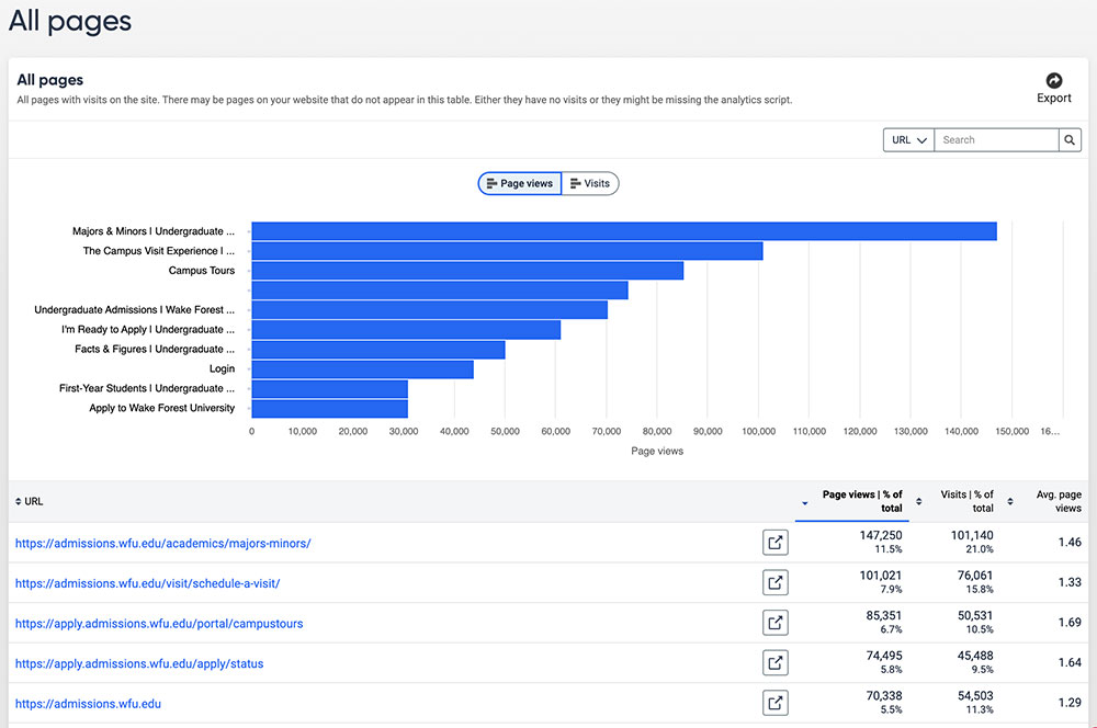
If you want to look for specific pages quickly, there is a search option available that allows you to search for URL or a page title. This feature is helpful if you’d like to see how much traffic a certain section on your site has received or if you’d like to look at the data for a specific set of pages within that section.
Example: On Undergraduate Admissions, there is a main Majors & Minors page with majors pages that are nested under that. It is helpful to understand not just how the majors and minors page is performing, but also how each of the majors pages are doing. Filtering by URL allows me to view this data in a more organized and collective way.

Analytics for a Specific Page
If you click on a URL below the bar graph, you are directed to the Page Overview screen for that URL (page). From there, you can use the metrics located in the Page Inspector panel on the left to add additional metrics or data categories.

Pages with No Visits
Knowing which pages have not received any visitor traffic during the selected time period can help you identify poorly performing content. A page might not get any traffic if it’s too deeply embedded in the website’s page hierarchy, making it difficult for visitors or search engines to find, or if the content is outdated or irrelevant.
Page Load Time
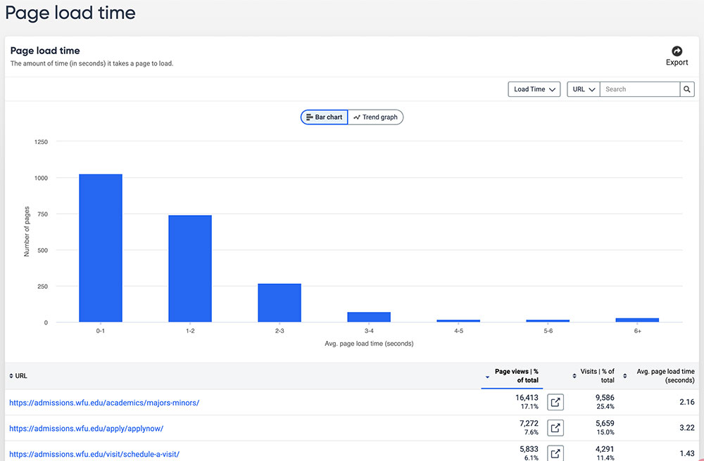
The amount of time (in seconds) it takes a page to load. On the bar graph, you can hover over each column to see exactly how many pages on your site load within a specific number of seconds.
Many pages fall victim to pages that contain large images and other content that can increase the time it takes for a page to completely load. It’s important to be mindful of all your visitors and understand that not everyone who visits your site is using a high speed Internet connection. Those who are viewing your site on mobile devices (phones, tablets) using 3G or 4G connections may experience a slow loading page if you have just one large photo on it. As a result, they may exit the page (and your site) before it’s done loading.
An ideal page load time is between 0-2 seconds, but 3 seconds is also considered to be an acceptable score. Anything above 3 seconds increases the likelihood of visitors leaving your site. However, you should consider the content on any page that has a load time of more than 3 seconds to determine if the content is necessary to have and, if so, is there a way to optimize that content.
Navigation Depth
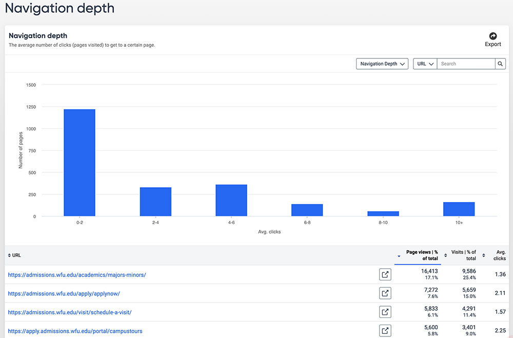
The average number of clicks (pages visited) to get to a certain page.
The bar graphs represent the number of pages that visitors to your site were able to reach within a certain amount of clicks.
To view the average number of clicks a page received, you can find that data in the last column in the table that follows the bar graph. Visitors on your site should be able to reach any page – ideally – within 2-3 clicks no matter what page on your site they’re on.
What is navigation structure of a website and why is it important?
The navigation structure of a website describes how different pages on your site are organized and connected to one another. For example, some pages and content can only be reached by visiting a specific page.
Visitors to your site typically look to your site’s navigation to find content they’re looking for. If it’s absent from your navigation, or a main page that they’re likely to be on (i.e. homepage), they may never reach this page. Users may resort to use an external search engine or WFU’s internal site search to find content quickly, but this does not mean you should not strategically consider where content exists on your site.
Parameters and Groups
Parameters and groups are not currently being used in our Siteimprove environment, but here is some general information about each one:
- Parameters: Visits and page view statistics for all parameters that have been added.
- Groups: Groups are used to display statistics for specific sections of the website or a collection of pages.
