Logo
Wake Forest University Logo
The Wake Forest University logo is the most visible and recognizable element of our identity. Our logo includes a contemporary version of the Wake Forest shield, the icon that appears in the University seal and as a wrought-iron architectural detail throughout the campus. Below the shield is a typographical treatment of our name that reflects our strength and stature. Within the shield, arching treelike branches suggest growth, collaboration and outreach. The lines converge at the center of the shield to form a subtle, stylized “W.” The division of the shield into two halves alludes to the duality of our University’s mission: We serve both an academic and moral cause, we are as devoted to humanity as we are to the pursuit of knowledge, and we develop the conscience along with the mind.

The two versions of our logo are stacked and horizontal. Either version is acceptable. The space limitations of a particular application will determine the appropriate version. The stacked version works best when it can be centered and floated in a generous margin of space, such as on the cover of a formal communication. The horizontal logo works well in tight horizontal spaces, such as in online banners and other applications with limited depth. In general, the stacked version is more traditional in style; the horizontal version is more contemporary.
The Wake Forest University signature and the interlocking “W” shield are registered trademarks of Wake Forest University. See University Logo downloads to access prepared digital art for the University logo. For permission to use the marks on merchandise and apparel, contact the Licensing Resource Group.
Size Requirements
The minimum sizes for reproducing the Wake Forest University logo are shown below. These sizes ensure legibility in all applications of the logo. The maximum size for reproducing the Wake Forest University logo is 600px. Never reproduce the logo smaller or larger than the sizes listed here. If you feel your website needs to be created outside these restrictions please contact Communications and External Relations.

Logo Color Versions
Whenever possible, use a version of the logo which includes both of our primary colors, Wake Forest Gold and black. This includes the full-color version on a white or neutral background (see the Neutral Palette section), the Wake Forest Gold version on black or the black version on Wake Forest Gold.
When the primary colors cannot be used, it is admissible to use the black one-color logo on a white or neutral background or the white logo reversed out of black. On black backgrounds, it is preferable to reverse out the Wake Forest Gold logo. If two colors are not available, the logo may be reversed out in white.
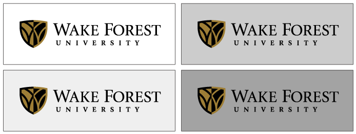
Full-Color Logo Usage
The full-color logo may only be used on either a white background or on a color specified in the lighter spectrum of the Neutral Palette section.

One-Color Logo Usage
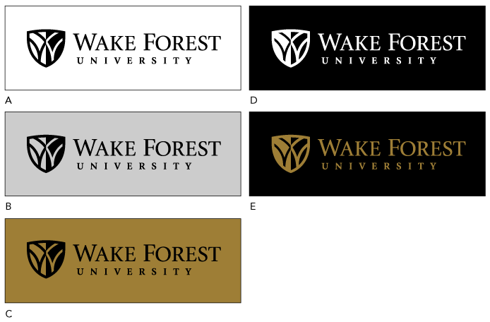
The examples shown represent the backgrounds allowed for the one-color logo.
A | Black logo on white background
B | Black logo on neutral background or paper stock (see the Colors section)
C | Black logo on Wake Forest Gold background
D | White logo reversed out of black background
E | Wake Forest Gold logo reversed out of black background
Incorrect Logo Usage
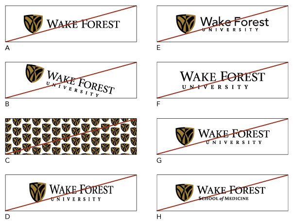
The examples shown represent incorrect usage of the Wake Forest University logo.

A | Do not use part of the logo, such as “Wake Forest” without “University.”
B | Do not angle or rotate the logo.
C | Do not use the logo as a pattern.
D | Do not stretch, distort or alter the logo in any way.
E | Do not use a different typeface in the logo.
F | Do not use the Wake Forest University logotype without the symbol.
G | Do not use centered type with the horizontal logo.
H | Do not substitute “University” in the logo with any name or descriptor.
Mobile / Responsive Header Logo
This logo has been developed for use in mobile and responsive headers and navigations. No other use is currently approved. If you have questions about whether your application is acceptable, please email web@wfu.edu.

Logo Dimensions: 300 x 36 pixels (should not be used at a size any larger)
Using the Shield Alone
The shield may be used without the “Wake Forest University” type in certain situations. The shield can be an effective graphic element, though it should never be used as a pattern. On collateral pieces, the shield may be used alone as long as “Wake Forest University” appears elsewhere on the piece, preferably as the complete logo. If you have questions about whether your application is acceptable, please contact Communications and External Relations.
Other Logos
To find information on other logos including specific school logos, departmental descriptor logos, and co-branding logos please see the more detailed Identity Standards Logo page maintained for print standards.
Athletics Logo
Wake Forest University Athletics logos may be used for communications related to athletic events. For graphic standards and information visit Wake Forest Athletics logos.
Wake Forest Baptist Medical Center
Wake Forest Baptist Medical Center is a separate entity from Wake Forest University and uses a separate logo. Do not use the Wake Forest University logo for any communication prepared for the Medical Center. For graphic standards and information about the Wake Forest Baptist Medical Center, contact Bowman Gray Campus Creative Communications.
