Behavior
What is Behavior?
Behavior provides several useful data tracking tools that allow you to analyze how visitors are engaging with your site. These tools provide a more in-depth look at specific actions visitors took while on your site, such as how far they’re willing to scroll on a page, their journey (pages they visit in what order), when they visit a page the most, and much more.
Setting up User journeys, Funnels, and Behavior Maps
You will need to contact your Siteimprove admin for help with creating new User journeys, Funnels, and Behavior Maps. If you would like to have the ability to add them yourself, you can request to be trained on any or all of these features separately from the standard Siteimprove training offered.
If you would like to have any of these set up on your site, or would like to set up additional training, please reach out to the Web & Digital Strategy Team to help determine what the appropriate solution is for you.
Summary
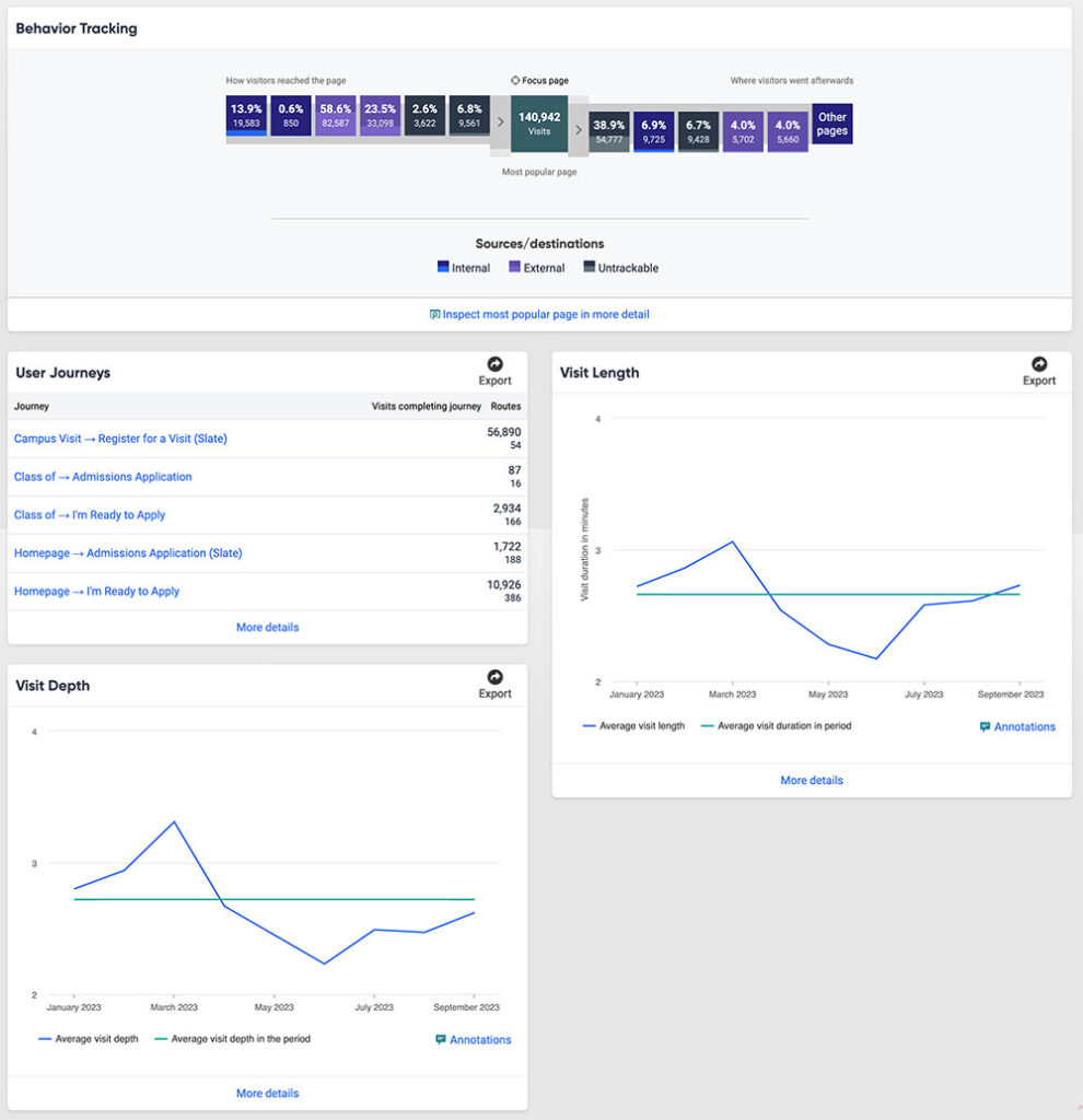
Your Behavior Summary, or dashboard, shows you an overview for different categories within the Behavior module. Your dashboard may vary from what is shown below, and if you want specific categories to show up in your Summary, submit a web request form and include what categories you’d like to have added.
Your Summary may include the following categories:
- User journeys
- Behavior tracking
- Behavior Maps
- Funnels
- Visit depth
- Visit length
- Visits by day of month, weekday, hour
User Journeys
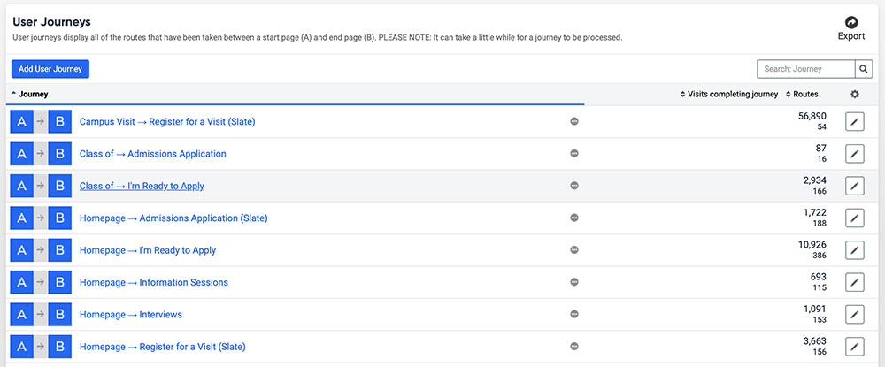
User journeys display all of the routes that have been taken between a start page (A) and end page (B). They can help you understand how your visitors are reaching specific destinations on your site.
When should I create a user journey?
User journeys should be created when you want to understand how visitors are reaching a page on your site that has some level of importance to it. End pages, or the final page a visitors is on while visiting your site, should have some call-to-action included on it. The idea is to get the visitor to a page on your site where you want them to take a specific action, like fill out a form or click a button.
Example: You added a feedback form on your site that you want your visitors to fill out. To create awareness for this form, you added a button on your homepage that points to it. By setting your homepage as your start page (A) and the page the feedback form is on as the end page (B), you will be able to see how many people went directly from your homepage to the feedback form page (likely from clicking the button), and also how many visited other pages after visiting the start page and before landing on the end page.
You will need to set up separate journeys for each start and end page you want to track. You can have multiple instances of the same start and end pages as part of your user journeys. (i.e. You can have your homepage be your start page for multiple user journeys as long as you set a different end page in each instance).
Understanding user journey data
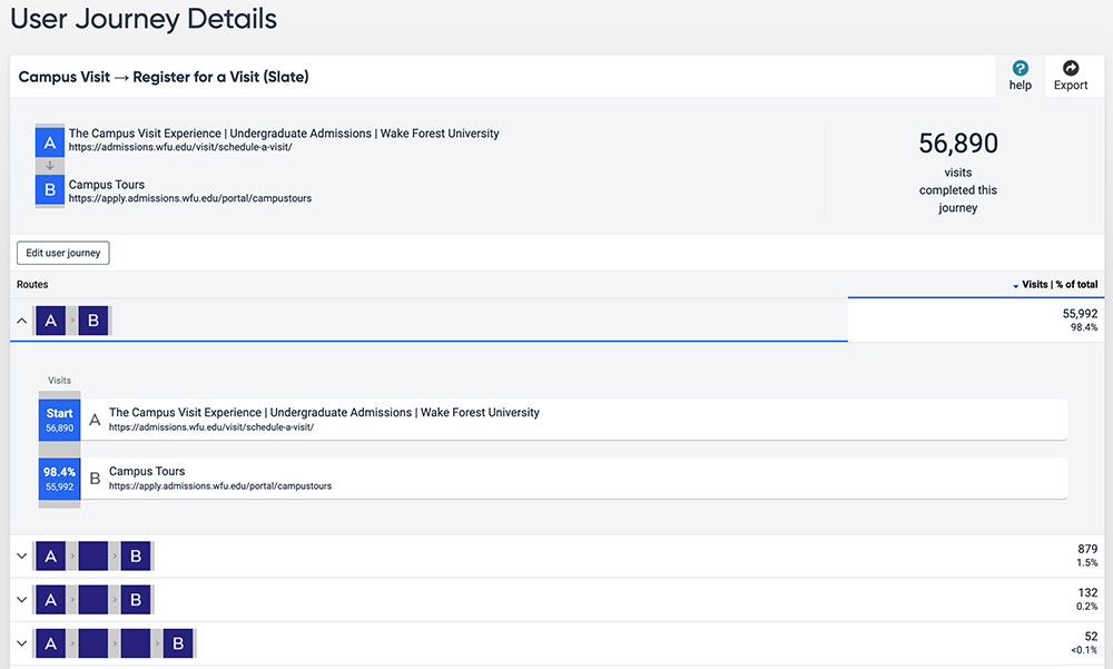
Once you have enough data collected for a user journey, you can click on a route (refer to screenshot below) to view the different paths visitors took on your site from your start page to your end page.
Note: You will only see routes that were taken while someone was on just your site. If a visitor left your site but came back to finish their journey, it will not show up here.
Journeys are filtered by which route visitors took between two or more pages most frequently. It is not uncommon for you to see results for multiple pages within routes since visitors may visit different pages after landing on your start page and navigating to your end page.
The percentage on the right displays the total number of visits that this route accounted for. If visitors visited multiple pages in a route, you’ll see the percentage of visits to each of those pages within that route.
When analyzing the data, it’s important to remember that the values that show up within a user journey are specific to only those visitors who completed the journey you set up.
Example: You set up a user journey to track traffic from your homepage (A) to your contact page (B). Your user journey data says 1,500 visitors completed this journey in the last 30 days. When you look at other behavior data, such as that from a click map, it shows that 5,000 people clicked a link on your homepage that points to your contact page in that same time period. So why does the user journey only show 1,500? It’s because only 1,500 out of 5,000 visitors completed the journey you set up, so it only tracked those who started on your homepage and ended up on your contact page as the last page they visited. The other 3,500 visitors clicked on the contact page link on your homepage but did not end their journey on that page – they kept exploring your site.
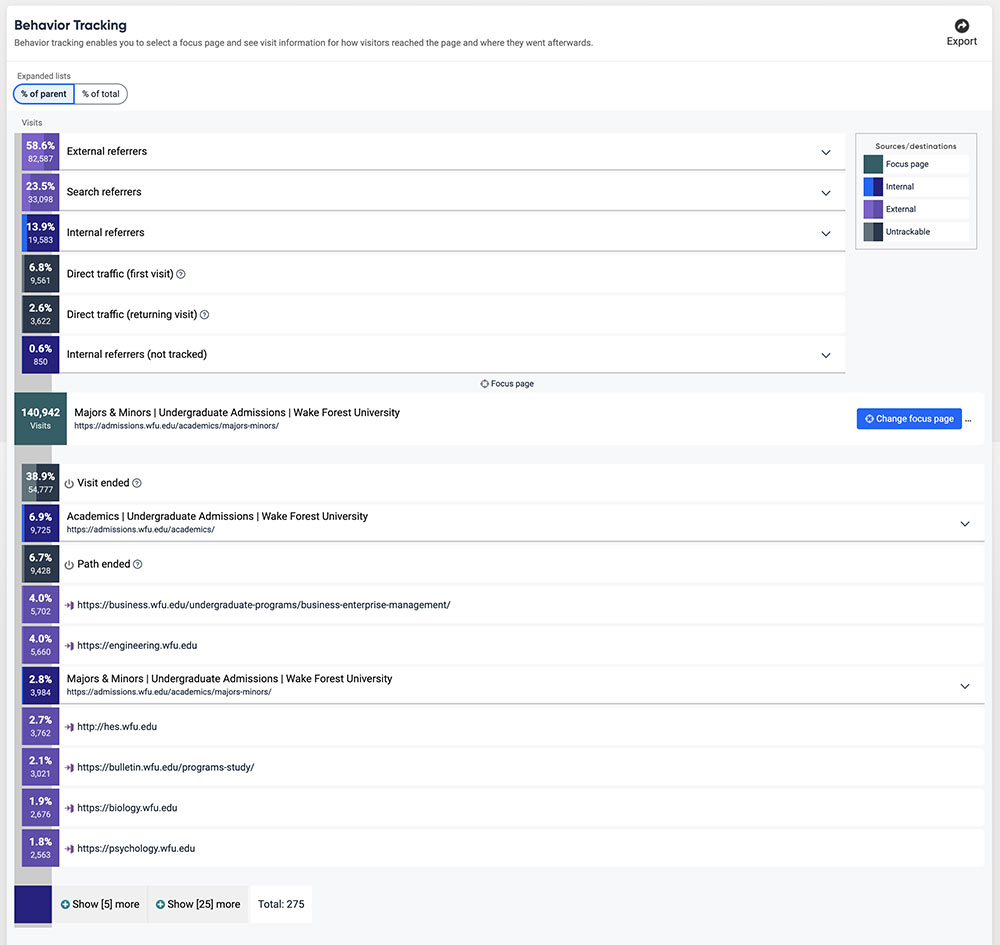
Behavior Tracking
Behavior tracking enables you to select a focus page and see visit information for how visitors reached the page and where they went afterwards.
In short, behavior tracking shows data related to how many visitors visited a certain page, how they got there, and what links they clicked on (if any) to leave that page. If you have multiple links on a page, this will provide you with data on what links are being click on the most (and least).
Behavior Maps
Behavior maps can be effective because they illustrate, in a visual way, how visitors have interacted with a page in a desired or undesired way. They allow you see what elements on a page a visitor has engaged with along with its data, such as where they click and how far they scroll.
Behavior maps are composed of four components:
It’s important to remember that you should allow sufficient time (several weeks or months in most cases) for enough data to collect before aggregating any results and drawing conclusions on how visitors are interacting with your page.
To view the any of the components, click on a behavior map that you created from your dashboard. A screenshot will be taken approximately every 24 hours of that page.

Behavior maps for different devices
You will able to view separate behavior maps for desktops (laptop/external monitor), mobile (phone), and tablets. It is not uncommon for visitors to engage with content on a webpage differently on mobile than how they would on a laptop based on the size of the device and how content is displayed, so it is important to understand how interactions happen on both devices.
How many behavior maps should I have?
There is a limit to how many behavior maps are allowed within the university’s Siteimprove subscription. Therefore, it’s important to only have behavior maps for pages where collecting this type of data would be helpful to better understand how your visitors are engaging with your content. Behavior maps are not meant to be created to track engagement on every page on your site.
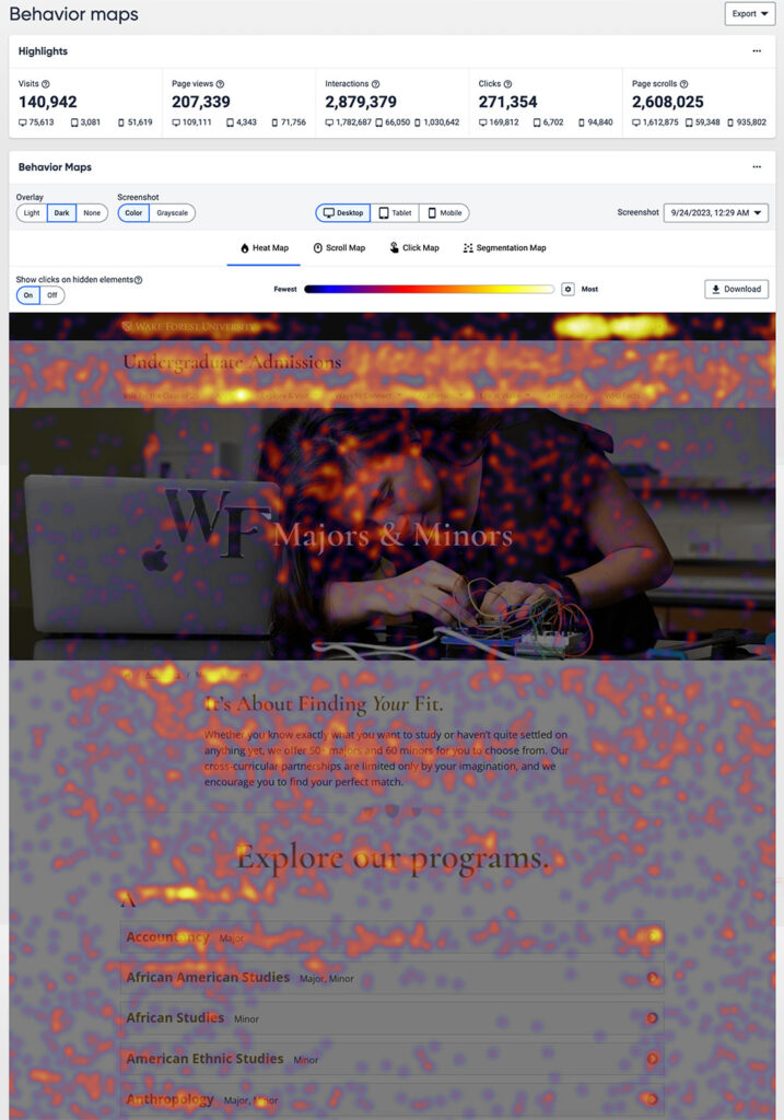
Heat Maps
A Heat Map is a visual overlay that collects click coordinates (or finger touch coordinates on mobile devices) by all visitors on a specific page. Because of their reliance on color to communicate values, Heat Maps are perhaps most commonly used to display a more generalized view of numeric values. It maps all visitors’ attention by marking the page with colored spots ranging from dark (cold; little attention) to warm (bright; a lot of attention).
Heat Maps provide a window into how and where page clicks on your page are happening. They can tell you if visitors rely on your site’s navigational menu to get around, or if they scroll down your page and click on a link there. They also help you see if visitors are clicking on elements that aren’t links but they think they are. This may be a reason for you to rethink how you have content on that page presented.
Scroll Map
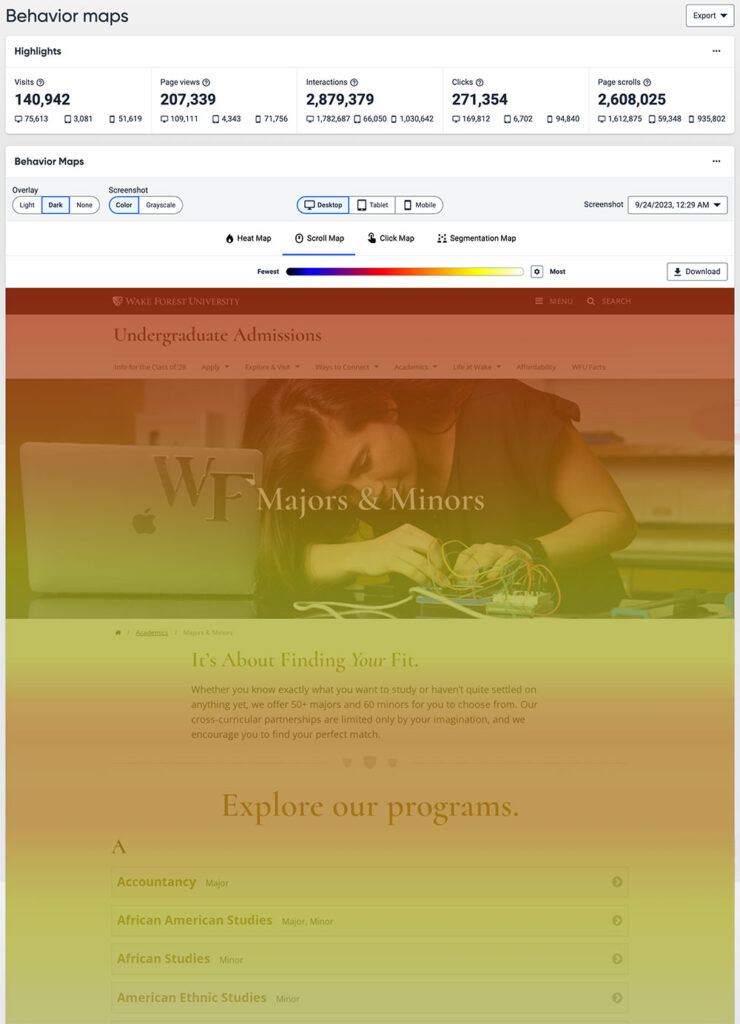
The Scroll Map allows you to see exactly how far visitors are willing to scroll to find what they are looking for on your page. The Scroll Map contains color gradients similar to the heat map. Visitor attention is measured from lowest to highest (from dark to bright colors).
If you have a long scrolling page and you notice that visitors aren’t willing to scroll past a certain point, it may be worth thinking about how to shorten the content on that page either by removing what isn’t needed altogether or moving some of the content onto other or new pages.
Click Map
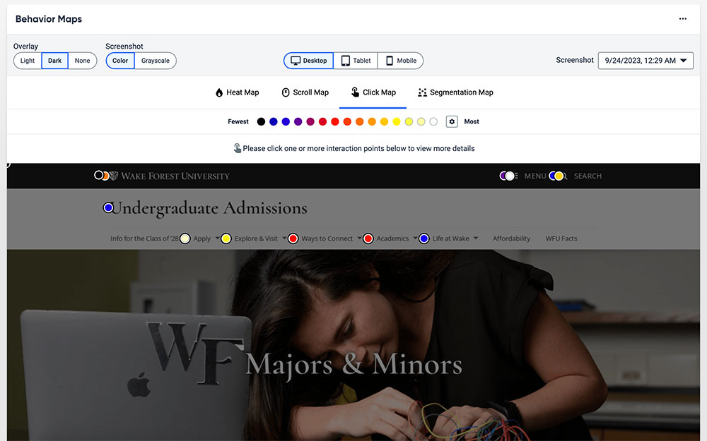
The Click Map provides an overview of every interactive element on the page you are inspecting. An interactive element is everything you can interact with on a page, including links, text, forms etc.
The Click Map can show you the difference between individual links with the same destination. For example, if a page contains two links that lead to the same destination – one at the top of the page and one at the bottom. The Click Map can show metrics to see which link performs better.
Click Maps are also a great way to see who prefers to navigate around your site using links on a specific page (i.e. homepage) vs using your site’s navigation (menu bar).
Segmentation Map
The Segmentation Map is a visual overlay that allows you to compare behavior patterns of different visitor segments. By using the Segmentation Map for your pages, you can learn more about the preferences and habits of your visitor groups.
Funnels
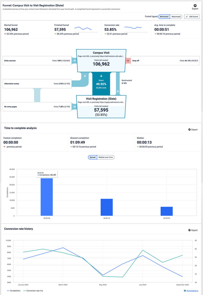
Funnels provide a detailed overview of how your visitors have followed or deviated from your funnel path. A completed funnel represents a successful conversion.
Funnels measure, visualize, and understand how visitors follow key steps on your website during a single session. This allows you to identify visitors’ pain points, improve conversion rates, and optimize content and design.
Visit Depth
The depth of a visit. Depth relates to the number of page views for each visit. Visits with a high number of page views suggests that the site is encouraging visitors to stay.
Visit Length
The length of a visit. Length relates to the time (in minutes) for each visit. If the visit length is typically low, you could investigate ways to keep your visitors on your site for longer.
Visit length is determined based on the time they spent on all pages on your site, not just a single page. If your site is action-focused (in other words, a visitor is there to perform a specific action and get off), visit length may be short. If you have a lot of information on your site which would result in visitors spending more time there, you may see longer visit time data. This is considered expected user behavior. However, if visit length data doesn’t match what you feel it should be, that could be because your visitors experienced a pain point while on your site for one reason or another and didn’t do what you were hoping the would.
If you’ve used Google Analytics 4 (GA4), visit length is similar to session duration.
Visits by Day of Month, Weekday, and Hour of Day
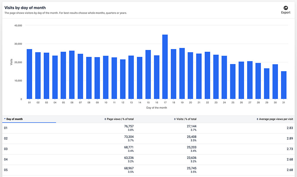
Visits by day of the month
This data shows you visitors by day of the month.
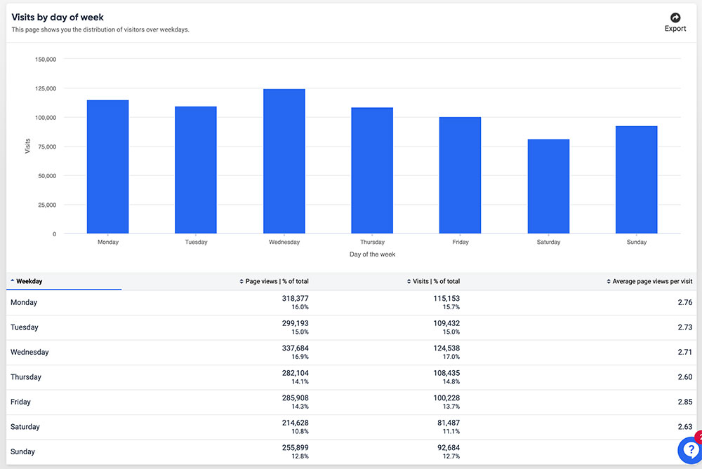
Visits by day of the week
This data shows you the distribution of visitors over weekdays.
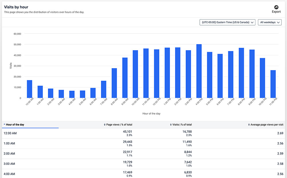
Visits by hour of the day
This data shows you the distribution of visitors over hours of the day.
